Tuesday, 28 August 2012

The Art of Photography – Assessment Results


I submitted this course for assessment in July 2012. My results were available in August. I was very pleased to hear that I had scored 78% and that the assessors report recognised the effort that I had made.

Advice for Future Study (this is reproduced from my results letter with future action in bold)

“Technically accomplished submission with evidence of an imaginative and experimental approach. Theme-based, self driven assignment work is rear at this level. You are committed to producing professional-looking images, taking risks and paying great attention to detail. Your design and compositional skills are paired with excellent observational skills. You learning log is exemplary and shows engagement with the discipline, relevant self reflective comments and evidence of research.”

“Further develop your editing skills to enhance the narrative values of sets of images and to avoid repetition that potentially weakens otherwise strong portfolios.”

This final sentence gives me a clear pointer for my next course of study. The first section of Digital Photographic Practice gives me the opportunity to remedy this shortcoming.

Richard Down August 2012

Wednesday, 30 May 2012

OCA Study Visit – 26/05/12 Burtynsky’s “Oil” at The Photographers Gallery

 
This was an exhibition ambitious in its scale and the size of its subject. It was set over two floors of the gallery and the images were printed and mounted in large frames. The contrast between seeing the images at this size and looking at them in a book or on a monitor made all the difference to the way I perceived them. At such a large scale I was able to look very closely at the detail of each of the images.
From We Are OCA:
“How is it that these two extreme poles of function can coexist in a single image?” … thought provoking question.
Posted to "We Are OCA" forum in reply to Dewald's post on Jose’s question:
A reproduction of the print at the start of this article was on sale in the gallery bookshop for £2500. I assume Jose was alluding to this when posing his question. Perhaps the question should be "These extreme poles of function do exist within these documentary images and is it right that they should be traded as art?"
From a wider perspective, is this a reflection of the change from a market economy to a market society where everything has a price tag and very little has value?
Jose replied to my post:
Good question too Richard. £2,500…in my opinion as soon as a photograph operates at that level of perceived value it starts to function like a fetish object. It becomes desirable because the prospective buyer feels that by possessing the object they may acquire some of the symbolic qualities of the object – e.g. environmental credentials. And a process of positive feedback begins. Paradoxically, I think that this process also enhances the documentary value of the photograph.
But the problem of ambiguity of meaning remains, which I what I implied in my question.
My reply
Another facet of the argument I hadn’t considered Jose, thanks for making the point. If it is the purpose of Art to promote discussion, Burtynsky certainly succeeds.
I also posted this summary to "We Are OCA" forum:
I think the exhibition posed more questions than it answered. Ultimately it comes down to individual perception. I was impressed more by the technical quality and impact of individual images than by the collection's documentary qualities. It is such a vast subject with so many overlaying and interlinked causes and effects that each could furnish a documentary project on its own.
This exhibition certainly provoked a lot of discussion, both on the forum, at the gallery and after the visit on the day. My personal view of the exhibition is summarised above. This is only my second study visit so I still learning about critique and how people perceive and express their ideas. I am hoping that future visits will give me the experience to express my ideas more freely and confidently.

Sunday, 13 May 2012

"il faut que je sois" Roeland Verhallen


12 May 2012
This small exhibition at Kings College Cambridge was enigmatic to say the least.
"The photographs will be presented alongside a critical review from the viewpoint of photographic theory, as delivered by Simeon Koole, a Cambridge graduate researcher in photographic history and theory. The exhibition creates a triad consisting of photographs, text and viewer, thereby facilitating constant interaction of all three elements."
"It must be that I am" http://www.roelandverhallen.com/
“I’m Roeland Verhallen. 20-years-old. Dutch. Photographer.
I’m always looking for new combinations of situations, objects and people.
Why take photographs of something that is there for everyone to photograph,
when you can create something unique instead?
It’s all about creating a certain ambience where someone can step in,
bathe in, and get out from with a feeling that will be with them
throughout the rest of the day.”
I recall the exhibition was about Time, Being and Ancestry. The review below gives some hint about its meaning although at this stage in my studies, much of it was lost on me. The photographs were beautifully composed and printed from a medium format (6x6) Hasselblad camera. The use of film is explained in the review.
http://www.varsity.co.uk/reviews/4679

Saturday, 5 May 2012

Exhibition – Jane Bown - Exposures


Bown Exhib
There is a link here to the Guardian interactive pages showing the images and video from the exhibition.
http://www.guardian.co.uk/artanddesign/interactive/2009/oct/22/jane-bown-photography
This was a very enjoyable exhibition covering the decades since 1949 when Jane Bown  had her first portrait printed in the Observer. I must have seen a lot of these early ones. The Observer was the Sunday paper of choice in our house when I was growing up and I used to make a point of looking at all the pictures even though the text didn’t interest me.
The accompanying video to the exhibition made it clear how simply Jane Bown worked, black and white film, available light, f2.8 at 1/125sec. With subjects as diverse as Lucien Freud and the Queen, she was able to engage them all to produce stunning portraits, some formal,(Orson Welles) others relaxed and playful (Bjork) This was a complete contrast to last week’s exhibition and a valuable insight into journalistic portraiture. especially those subjects who were photographed in context, Francis Bacon, Henri Cartier Bresson, Ninette de Valois, Jacob Epstein, which tell you so much more that a simple head shot.
Winchester Photographic Society Exhibition
A very large range of photographic subjects were covered by this exhibition, some stunning black and white portraits, wonderful wildlife and some nice landscapes. It’s a shame that HDR software seems to predominate the colour landscapes but I hope that as a gimmick it will soon pass. I think it makes everything too samey. That is a discussion for another forum. On the whole I enjoyed the work shown. A link to the Society’s website where some of the images are on display: http://www.winphotosoc.co.uk/site_1/index.php

Saturday, 28 April 2012

OCA Study Visit 28/04/12 – Gillian Wearing Whitechapel Gallery


Introduction
This was my first study visit with the OCA and I was sent very useful joining instructions which set out the objectives for the visit:
 gain a personal perspective on the work of Gillian Wearing
 reflect on the experience of seeing photography and video in a gallery
 network with other OCA students

The introductory video by the gallery curator Daniel Hermann is here:
http://www.youtube.com/watch?v=qv02v3aOrC8
In it, he states quite clearly “Gillian Wearing is interested in the divide we build between the front stage and the back stage of our lives” and “the powerful discrepancy between the public and private is at the heart of the work of Gillian Wearing”.
I have also read two articles from the Guardian newspaper, the first gives some background to the exhibition and the second is a review by Laura Cumming:
http://www.guardian.co.uk/artanddesign/2012/mar/04/gillian-wearing-whitechapel-gallery-feature
http://www.guardian.co.uk/artanddesign/2012/apr/01/gillian-wearing-whitechapel-patrick-killer-tate?intcmp=239
This link gives some more background to the exhibition with some interesting images of the construction of the masks for the album series.
http://www.guardian.co.uk/artanddesign/gallery/2012/mar/27/gillian-wearing-takeover-mask?intcmp=239#/?picture=387780737&index=7
A personal perspective
The first objective is probably the most difficult to tackle. It is now three days since the visit and I am still trying to make up my mind about how I feel about this body of work. This degree course is my first encounter with the arts. As yet, I don’t understand a lot about why artists do what they do and what motivates them.
From the information above, it is quite clear that the purpose of the work is to examine the differences between the perception of ourselves that we present outwardly and  the private, hidden self within us. In Tim Adam’s article for the Observer, he starts his piece recounting an overheard conversation on the top deck of the 55 bus. This relatively new phenomenon shows how readily we are prepared (almost without thought) to share details of our lives in public.  Social networking, blogging, ‘reality’ TV shows, instant communication and celebrity see us sharing more of our lives with the world. This seems to be self perpetuating, the more we see, the more we want to see and share. With the current speed of  communication and interaction, perhaps Andy Warhol's alternative quote “in 15 minutes everyone will be famous” could be just around the corner.
As a group, we looked closely at these parts of the exhibition:
  • Signs that say what you want them to say and not signs that say  what someone else wants you to say.
  • 2 into 1
  • 10 to 16
  • Crowd (a painstaking video  reproduction of Albrecht Dürer’s “A large piece of turf” 1503) link here
Of these, “Signs…” was the one I found most interesting. Given that the subjects were presumably given a free reign on what they wrote, I wonder if there were perhaps some frivolous thoughts or even if there was an element of people writing what they thought was expected (i.e something outrageous) rather than what they were actually thinking. I’m sure most of us are thinking very banal things most of the time.Very difficult to judge and equally thought provoking. Michael Lawton, who showed us around the gallery mentioned that apparently,  the suited business man holding the sign “I’m desperate” rushed away from the scene once his photograph was taken. I wonder if he was “desperate” for the bathroom? (That note of cynicism still surfaces, is that healthy?) I think this was a good way to engage people in the creation of an artwork and the signs make you think “what would I write?”
In the same gallery space there were three contemporary small painted bronze sculptures of named individuals, all heroic in very different ways.
Crowd It would have been easy to overlook this small video screen tucked into a corner. I thought this was a very interesting and simple idea. The artist has  reproduced this 16th century watercolour by Albrecht Dürer and  produced a 15 minute video loop. To see any change you have to search the image almost as minutely as the artist’s recreation was painstaking but you are rewarded with subtle changes in light and the movement of ants over the leaves.
2 into 1 This was amusing. Twin boys’ comments lip-synced by their mother and vice versa was a very clever idea and although the things they said were as you would expect from a mother and her sons talking about each other, each twin reacted to his mother’s words as they were played back and synced by his brother. It must have been toe curling and embarrassing for all parties but they carried it off brilliantly.
10 to 16. This I found strangely disturbing. Seven children from the ages of 10 to 16 speaking about their lives, their words lip-synced by adult actors. Again, with the exception of the 16 year olds contribution, much as you would expect to hear from children of this age. To hear children’s voices from the mouths of adults seems somewhat sinister to me. During  discussions it was mentioned that perhaps this was a device to make us listen more closely. I wondered if  one or two in this series of videos were deliberately designed to shock. One of the children’s voices was lip-synced by a naked dwarf sat on the edge of a bath which was disturbing (to me at least). The final sequence from the 16 year old was also provocative in that it was graphic in it’s description of the boys confusion over his sexuality. I’m afraid I am of the generation that stills finds four letter words cause me to wince inwardly although I do  accept them (reluctantly) as part of everyday expression.
Album (the family likenesses) I didn’t know how I felt about this at the time and nearly a week later I’m still uncertain. I can understand the idea that you may wish to draw attention to family likenesses and that to wear a mask and body suit of a relative to show an intimate connection  reinforces this. What I do admire is the execution of the idea, a very complex and time consuming process which produced something of interest. As a technical process, very challenging. Is that its own reward perhaps? This work tells us something about Gillian Wearing but I’m not sure what. The second part of this gallery, the artists Wearing considers her major influences, is clearly meant as a tribute to Arbus, Mapplethorpe, Warhol Cahun and Sander. Again the masks are beautifully created and the poses are based on existing photographs. I’m not sure if this type of work has ever been done on this scale before. Maybe this is the artist’s motivation?
There were other video sequences to watch, the confessions series, and one or two others but I had seen enough. I found the video “Dancing in Peckham” amusing for a few seconds and was more interested to see the reaction of passers by who seemed to treat the arm waving and head banging dancer as part of the everyday experience of a shopping centre.
All of this makes me think that it is more important that I preserve (rather than hide) my “backstage”. I don’t consider that I have anything to hide but on the other hand, there is a lot which could be misinterpreted or misused and besides, I have to reserve some aspects of my personality for those I wish to be intimate with. After all, if you show it all to everyone, what is left? I think Gillian Wearing knows this only too well.
The Gallery Experience It was pointed out to us as we entered the first part of the exhibition where the majority of the video screening booths were located, how like the “backstage” area of a theatre it was with the unpainted wooden framework exposed all around us. The photographs were hung differently, the Signs series were arranged like large contact sheets, the Album series at differing heights with different coloured frames, an informal family collection whereas the others on the opposite wall were of similar size and arranged formally in a straight row. I’m not sure whether these arrangements affected the way I perceived the exhibits, it may have been very subtle.
Networking This was certainly a very effective way of getting to meet other students, a tutor and staff involved with the OCA. Lively discussion took place in the gallery Cafe about the exhibition, our individual courses, submissions for assessment events, art and photography in general. A very worthwhile and rewarding experience topped off by an additional visit to the FOTO8 Gallery to see the Dana Popa “After the New Man” exhibition.
A slideshow of the images is available on the link above. Essentially, the photographer has documented the everyday lives of the young people in post Communist Romania. These images were supplemented by a caption list which provided a commentary; echoes of the past interspersed with the hopes that these young people hold for the future.
Reflection This visit has gone some way to help me to understand what art is, why artists do what they do and the role of  the artist in society. I read on one of the OCA forums last year in which Clive W. said that our understanding would come in time. I think I am a little closer to flicking that switch.

Wednesday, 29 February 2012

Assignment 5 feedback and reflection


I am pleased that my tutor liked this assignment:
“This, your final assignment, is a good choice of subject, lots of interesting shapes, plenty of activity and picturesque settings.”
He also gave me feedback on individual images. I will attempt to respond to his critique and maybe explain my thoughts behind  choosing the images I did and where possible, offer alternate or edited images that can be included in my submission for assessment in July.
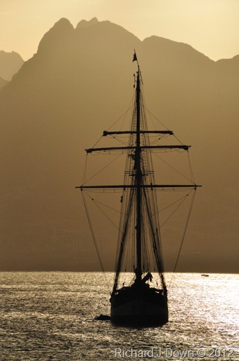
Cover Illustration – Tutor made the point that this looked like an end rather than a beginning being a sunset. As a first impression this may be correct and I can understand that point of view. However I chose it because of its impact and its simple graphic shapes and colours. As a cover illustration it grabs the attention. I don’t think its position in the story matters at this stage. Ideally I would have used an image of the schooner in full sail but sadly, sea conditions meant this was not possible. (as noted earlier) An editor would no doubt have obtained such an image from a stock library.

Picture 3 – “This one is a bit of a jumble. Perhaps if you had been further back, (can be a problem I know in a confined space) or used a wider angle lens, you could have played around a bit with the composition. Don’t know what to look at really. Part of the problem is that they appear to be looking at something outside the frame, a bit like a football photo without the ball in it if you see what I mean”
To be honest, I couldn’t see a problem with this one. To see what they are looking at just follow the diagonals of the ropes they are holding. Although the pin rail disappears out of the frame, you can infer it from its’  line. What they are doing is “sweating” the ropes i.e. making them as tight as possible  before belaying them on the rail. Here is an alternative but I feel it would lead to too many truncated limbs if I cropped it. I’ll play with it to see if I can make it work.
*4th March – I did a bit of work on this print and will submit the result in response to feedback.
DSC_9905007A_SM*

Picture 5. – “ Technically it is fine, good exposure etc. The problem for me is that again they are looking at something but the viewer doesn’t know what, it doesn’t help that they are too near the edge of the frame they are looking at. There should be more space between the direction of their view and the frame edge than behind them.”
Point taken. This was already cropped down from a landscape wide angle shot of the wheelhouse. What I have tried to do is to place it on the right of the double page spread so that the figures are looking across to the view of the sails as they would be in front of them. (see page mock up in the previous post). I wanted to match the late afternoon light as both images were made within minutes of each other. Here are two alternative images I will choose one to submit in response to feedback:
DSC_9457DSC_9714_edit01_web *
*4th March – I selected the second print here as a substitute.
Following eye lines can be problematic in these situations. Subjects are quite often scanning the horizon just “looking out” (it’s part of the job) or watching the results of their efforts hauling on a rope thirty or forty feet above their heads which is impossible to get into shot.

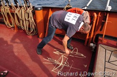
Picture10. - I like the circle and the lines and the viewpoint and the colours. I wouldn’t have chopped his left hand off at the top.
I’m afraid amputation is a risk of spontaneity! This was a grab shot made on the spur of the moment as the captain demonstrated the running rigging. My eye was on what his right had was doing. his left was merely steadying him as he drew. This is the only alternative shot of  the scene and it loses a lot of what the  tutor liked:
DSC_9570

Reflection on Assignment 5: Of all of the assignments for this course, I have enjoyed this one the most. I spent two weeks doing two of the three things I enjoy most, photography and sailing. (I also made some movie clips but that’s my next course). As with the exercise I did at the carnival, the most difficult part was selecting the images to include. I am definitely being more selective and have learned to cull images and work with fewer ideas and make sure that the ones I present are as good as I can make them. I hope I did that when I abandoned my attempt to include too much into this photo narrative. From my tutor’s feedback I need to be a little more careful with my composition and try to plan more carefully. In this particular situation I was not always sure what would happen next. I tended to photograph everything that happened when I wasn’t required to partake and constructed a narrative from what I got. I’m not sure this would work if my involvement on the voyage was limited to a day or two.

Reflection on The Art of Photography Course: There is no doubt that I have learned a lot from this course as I expected that I would. I have a better knowledge of how to use my digital SLR, mainly because I have used it so much in such a short space of time. I now look for shapes and lines when framing my images and I am more aware of the use of colour in composition. I hope that I am able to interpret what is required from a brief although I am still aware of my somewhat conservative attitude towards photography.
I hope that by studying Digital Film Production Creative Concepts I may be able to loosen up a bit by experimenting with a medium in which I don’t have years of bad habits to unlearn. I’ll put my  DSLR away for a while and embrace something new that will enable me to be creative in a different way.
Richard Down 29th February 2012

Monday, 20 February 2012

Assignment 5–Applying the techniques of narrative and illustration: continued

Update 19th February
Selection of Images for Assignment 5
With so many images to choose from and with such diverse topics to be included, I have decided to narrow the topic of the photo essay/narrative to my time on board the ship and the activities involved with sailing her around the Cape Verde Islands.
Posted below are the images I have included in the narrative which were not in my last post.
9740: 1/800s f7.1 ISO200 70mm (cropped) **
DSC_9740_crop_web
When at anchor, the crew run a regular dinghy service to and from the shore.

9569: 1/200s f7.1 ISO200 18mm (cropped) **
DSC_9569_crop_web
Captain Laurens explains the running rigging for the topsail yards.

9961: 1/500s f11 ISO400 34mm **
DSC_9961_web
The island of Sal appears on the starboard bow.

9984: 1/250s f9 ISO400 28mm **
DSC_9984_edit01_web
The permanent crew for the Oosterschelde voyage CV6 January 2012
** Images selected for my essay

The photographic layout and narrative

The thirteen images I have selected for the narrative/essay needed to be laid out and related to one another. The images are grouped with a specific theme or group of related activities on each page and will provide a narrative when read as a whole. I have added captions to these mock ups to expand on the titles I have given each spread. Each image (apart from the cover) represents a double page spread but saving them as JPEGs has done something strange to the page numbering but they are in the order of viewing in the table below, left to right.
Clicking on the thumbnails below will open a new window to show a larger image.
OosterscheldeCV6_01_web
OosterscheldeCV6_02_web
OosterscheldeCV6_03_webOosterscheldeCV6_04_web
OosterscheldeCV6_05_webOosterscheldeCV6_06A_web
Conclusion: As the final assignment for the Art of Photography Course this has been an immensely challenging task to complete but very enjoyable none the less. I think I have answered my tutor’s critique of some of my work in previous assignments. There are only two images here that do not contain people and the narrative includes the teamwork and cooperation required to sail this historic ship. I would like to thank the permanent crew and my fellow guest crew members for their understanding – while I was making photos, they were doing the work! 
I made enough images to complete three different essays and I was struggling to find ways of introducing the people and landscapes of the Cape Verde Islands but with a limit of 12 images I decided to keep it simple and concentrate on the sailing of the ship. The brief indicates that these images should be part of an article. I hope that I have kept the captions sufficiently brief and that the pictures themselves tell a story.
I still have to go back through my learning log and tidy it up and add some notes on the books I have read. I have applied for assessment in July and have most of my images printed ready for submission. I will submit these 13 images to my tutor this week.

Sunday, 12 February 2012

Assignment 5–Applying the techniques of narrative and illustration


Brief: To imagine you are illustrating a story for a magazine with a cover illustration and between 6 and 12 images on inside pages. Write captions to explain and link each picture. Use the techniques of illustration for the cover page and those of narrative for the picture essay.
For this assignment I have chosen to illustrate a sailing trip on board  the three masted Dutch topsail schooner “Oosterschelde” around the Cape Verde islands in January – February 2012. At the time of writing, (24th January) I am just putting down ideas about which aspects of the trip to include or highlight. It will last from 24th January until the 4th of February, leaving from and returning to the island of Sal. The voyage will include visits to maybe 5 or 6 of the 10 islands and 5 islets over the 11 days. The actual route will depend on the weather. There are several aspects that can be included:
  • The time line of the voyage itself.
  • The interaction of the crew. Made up from permanent ship’s crew, experienced and less experienced guest crew, there is a very steep learning curve and a great sense of achievement to be gained from sailing a traditional vessel.
  • The experience of living on board ship in close confines with other people.
  • The graphic qualities of  the schooner itself, 19th century technology, rope, canvas, wood, steel and brass.
  • The ports and islands visited on the trip including the local people and landscapes.
Update on 30th January
The trip is going well and I have edited an  image for the illustration cover picture.
9672: 1/4000s f14 ISO800 200mm **
DSC_9672_edit01_web
Oosterschelde in Mindelo Harbour, Sao Vicente, Cape Verde
Update on 2nd February
As the trip draws to an end and we have a slack day in Boa Vista with overcast skies and rain, I have started to assess the images I have made so far to construct a narrative about the whole experience of sailing a 94 year old Dutch schooner around the Cape Verde Islands. My first decision was to use image 9672 above as the cover page for the article. I would liked to have used a photograph of the ship in full sail but having discussed the possibility with the captain, the wind conditions have not enabled us to launch and recover the ship’s inflatable safely, whilst under sail.
From the bulleted list above, I have selected to illustrate the crew at work, some of the places visited, the local people and aspects of the ship. With a couple of days left, if  there is anything I am missing I will have a chance to re-shoot.
I have chosen and captioned these images to illustrate life on board the ship. With so many images  to choose from, they won’t all make the cut.
9456: 1/100s f5 ISO400 18mm (cropped) **
DSC_9456_edit01_crop_web
Three hundred and twenty tonnes in your hands!. Geert takes a turn on the helm as the sun sets on the first day. Steering with the compass, the wind and the waves needs a lot of concentration and takes some time to master..

9451: 1/500s f11 ISO200 18mm **
DSC_9451_edit_web
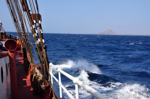
Sails set, heading 208°. On a broad reach to Tarrafal, Santiago with the outer jib, topsails, course and schooner set on the foremast and the mainsail and main gaff topsail set on the mainmast. Speed about 7.5 knots.


9533 1/200s f7.1 ISO 400 55mm
DSC_9533_edit01_web
Crew member Ben shows how to splice a rope end.

9542 1/60s f4 ISO400 22mm
DSC_9542_edit01_web
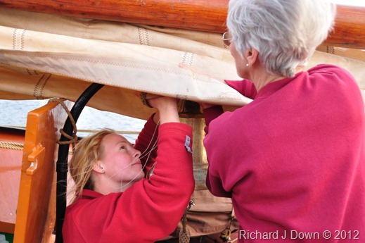
Anouk and Ulricke repair a sail.

9559 1/400s f10 ISO 200 18mm **
DSC_9559_edit02_web
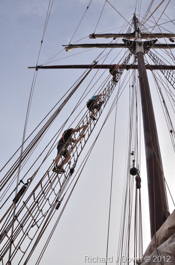
Climbing the ratlines to release the topsails from the yards.

9564 1/640s f6.3 ISO200 120mm
DSC_9564_edit01_web
Anouk and Job working aloft on the lower topsail yard.

9695: 1/640s f5.6 ISO200 200mm **
DSC_9695_edit01_web
Leo releasing the gaskets on the topsail yard.
9698 1/250s f9 ISO 200 18mm **
DSC_9698_edit01_web
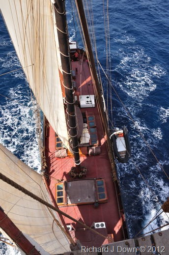
The deck from the foremast platform showing the schooner and mainsails.

9709: 1/320s f9 ISO200 18mm **
DSC_9709_web

Leaving Sao Vicente astern as we make our way to Sao Nicholau.

Update on 4th February
Looking at the pictures above, There is nothing there that shows the sheer hard work of  hoisting and trimming the sails on a ship that has no winches or mechanical aids (other than pulley blocks). Yesterday I kept my eye open for an image that would show this. This one works well I think:
9907: 1/250s f8 ISO400 48mm **
DSC_9907_edit01_web
Bracing the yards. Once the topsails have been released from the yards, a lot of hard hauling is required to turn or “brace” them on the masts. Once that is done, the buntlines and clewlines are released to unfurl the sails. 19th century technology relies on muscle power and a few pulley blocks. There is not a winch in sight (the anchor excepted).

There was also another sail repair going on this time with more detail.
9968: 1/1000s f8 ISO400 75mm **
DSC_9968_edit01_crop01_web
Anouk repairs the mizzen sail.

9968: 1/320s f9 ISO200 18mm
DSC_9590_edit01_web
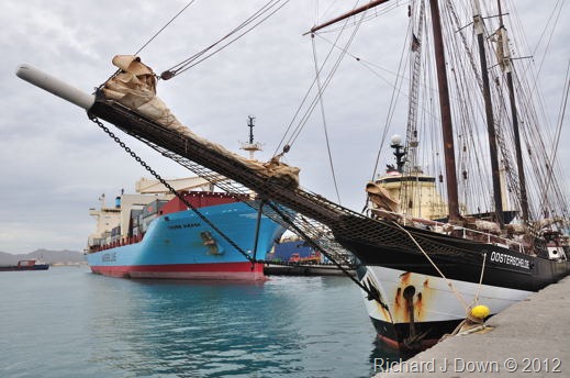
The Oosterschelde docked in Mindelo Sao Vicente for bunkering (taking on fuel). I was able to use  juxtaposition to contrast more traditional and modern cargo ships separated by over 90 years of history.

9594: 1/250s f5 ISO200 82mm
DSC_9594_edit01_crop01_web
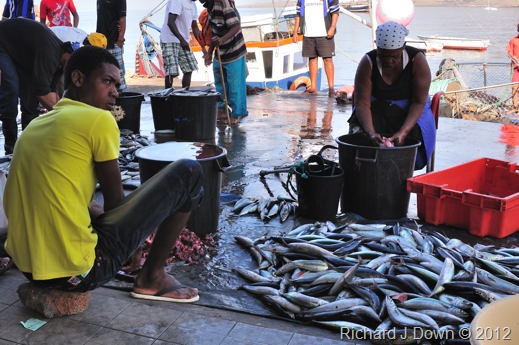
Fish sellers, Mindelo Sao Vicente.

9490: 1/125s f22 ISO200 18mm
DSC_9490_edit01_web
Santiago: The view from Serra Malagueta towards Assomada and Pico do Santo Antonio.

9675: 1/125s f5.6 ISO800 130mm
DSC_9675_edit01_web
February is Carnival time in Mindelo – fundraising can seem intimidating but a few Escudos resulted in a great image! Many Cape Verdeans celebrate their African heritage in their musical style and rhythms.

9749: 1/200s f7.1 ISO200 18mm (cropped)
DSC_9749_edit01_web
Cleaning fish – Tarrafal Harbour, Sao Nicholau.

9828: 1/320s f9 ISO800 18mm
DSC_9828_edit01_web
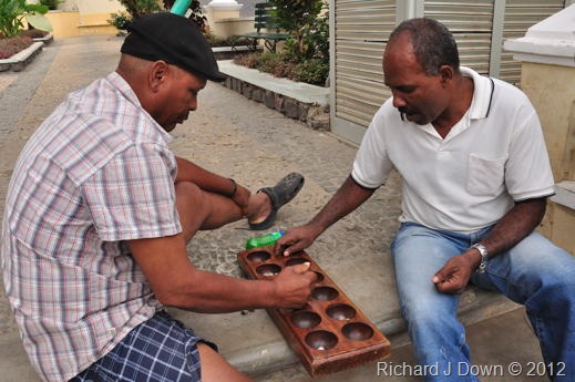
Playing Oril, an incomprehensible game with pebbles and holes. Vila Ribeira Brava, Sao Nicholau.

9779: 1/80s f4.8 ISO200 60mm
DSC_9779_edit01_web
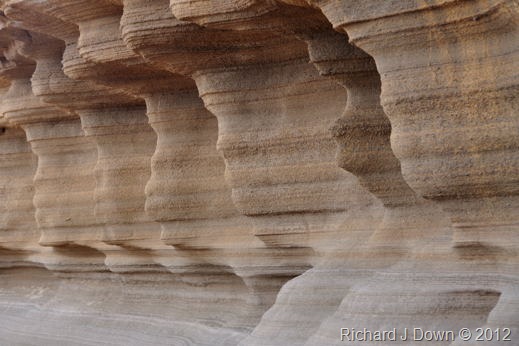
Water and wind blown erosion of volcanic sediments, west coast of Sao Nicholau.

9th February 2012
As I work through the many images that I have taken during the trip, I realise that I am going to have to work hard during the editing process. I wanted to include all aspects of the trip but I need to be able to emphasise what the trip meant to me.
**  Images which were selected for my final essay/narrative.