Sunday 28 August 2011

Part 4 Light–Project:The Colour of Light


Exercise: Judging colour temperature 1:

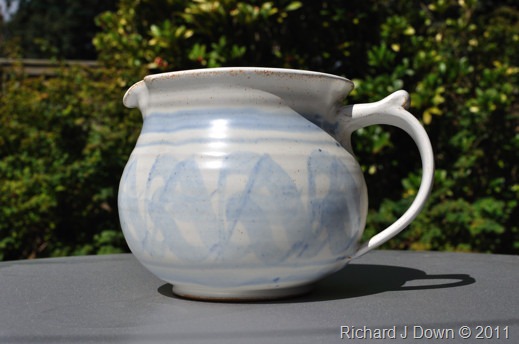
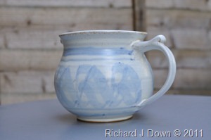
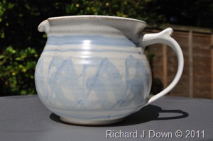
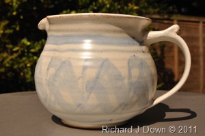
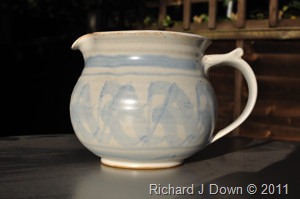
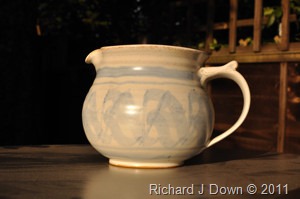
The objective here is to make three photographs taken in three different types of light; i.e midday sunlight, low angle sunlight (close to the horizon) and at midday in shade. The camera’s white balance setting was left at sunlight/daylight for all three images. I then compared the colour of the images. I used a fixed focal length lens of 35mm for this exercise.

7370: 1/4000s f8 ISO800 (oversight) WB Daylight Early morning sun

DSC_7370_low_sun_web

7384: 1/125s f5.6 ISO200 WB Daylight Midday shade

DSC_7384_shade_web

7386: 1/500s f11 ISO200 WB Daylight Midday direct sunlight

DSC_7386_midday_sun_web
Conclusion: This pale grey pottery jug standing on a neutral grey base gives a good indication of the colours of daylight in different situations. Low angle sun (8:30am) shows a distinct yellow cast throughout, on the base, the pot and the fence panel in the background.
Midday shade provides a much bluer light, the blue decoration of the pot seems more intense and the grey baseboard has a definite blue cast.
Direct midday sunlight (August) has rendered the pot and the baseboard to be neutral “as expected” in colour and as matched by the camera’s colour temperature setting.

Exercise: Judging colour temperature 2:

For this second part of the exercise, the objective is to make three exposures under each of  the lighting types and to apply a different white balance setting for each using the daylight(sunlight), shade and Auto white balance settings.
Midday Sunshine – Shade
Direct sunlight settingDSC_7389_Sunlight_web Shade settingDSC_7390_shade_web
Auto settingDSC_7391_auto_web

The Auto White balance appears to have rendered the scene nearest my perception of  the colour. The shade setting is too warm and the direct sunlight setting is too cool.

1/90s f4.8 ISO200 35mm

Midday Sunshine – Direct

Direct sunlight setting
DSC_7393_sunlight_web
Shade setting
DSC_7394_shade_web
Auto setting
DSC_7392_auto_web

The shade setting has again made this too warm but there appears to be little difference between the Auto and the Direct Sunlight settings apart from a very slightly bluer cast on Auto.

1/500s f11 ISO200 35mm

Low Evening Sunshine – Direct

Direct sunlight setting
DSC_7401_low_direct_sunlight_web
Shade setting
DSC_7402_low_shade_web
Auto setting
DSC_7403_low_auto_web

The only real difference here from the midday images is the expected yellow cast from the direct sunlight setting, the shade is too yellow and  the auto is again slightly blue but less so than at midday.

1/350s f9.5 ISO200 35mm

Judging colour temperature, conclusion: I have noted my preferred setting for each of the types of light above. Over the years I have become aware of colour temperature and learned to compensate for its effects on film, by the use of filters and with digital by camera settings and post processing. It is interesting to note that by using RAW files, I can apply each of the white balance settings in turn to a single frame. I like to see an orange/yellow cast in a picture with long shadows. It seems unnatural otherwise. Conversely, when making images in snow, I prefer to dial down the blue cast produced from a blue sky.

Saturday 27 August 2011

Part 4 Light–Project:The Intensity of Light

Exercise: Higher and lower sensitivity
The objective for this exercise is to take a number of shots in a marginal  light situation i.e. a difficult shooting situation where, movement, depth of field or image quality could be compromised. The first shots with a low sensitivity setting  and then with a higher one to see if  there was an improvement.
This exercise sounded easier to achieve than it actually was. I got a nice dull day so drove into town to find a busy shopping street but the place was very quiet. I wandered around for about 75 minutes and got a few shots, I’ll write a few up but I think I’ll have to try again. (All of the photos were taken with 18-200mm Vibration Reduction lens which allows me to hand hold at lower shutter speeds and the matrix meter setting was used throughout)
7333: 1/45s f11 ISO 100                                                 7335: 1/45s f38 ISO 800 
DSC_7333_edit01_web DSC_7335_edit01_web
My idea here was to make a direct comparison with  the depth of field available using different sensitivities. I kept the shutter speed the same but the higher sensitivity allowed me to decrease the aperture to f38. The difference in the depth of field is very clear.

7342: 1/60s f19 ISO 800 150mm
DSC_7342_edit01_web
7343: 1/60s f8 ISO100 120mm
DSC_7343_edit01_web
Here, I was demonstrating the difference sensitivity would make to the aperture setting. I would have expected to have needed f22 with the ISO800 setting but perhaps the slight difference in focal length accounts for the ½ stop difference. There is very little impact on the depth of field at this focal length. At ISO100 there is slight blurring of movement at 1/60s but this may be more to do with the speed of movement. (comparing the feet of the pedestrians, see below).
DSC_7342_crop_web DSC_7343_crop_web

7348: 1/15s f5.6 ISO 100 170mm
DSC_7348_edit01_web
7349: 1/180s f5.3 ISO 800 95mm
DSC_7349_edit01_web
These shots demonstrate the effect of attempting to shoot moving creatures at low sensitivity levels. These Mallards were very lively and difficult to pin down using an ISO of 100. Increasing the setting to 800 has a dramatic effect on the ability to freeze movement in the image.

7353: 1/20s f5.6 ISO 100 170mm
DSC_7353_edit01_web
Although the blurring of this image suggests movement, because the shutter speed is so low, very little of it is focus, even with the VR lens, I was not able to prevent camera shake.
7354: 1/125s f9.5 ISO 800 75mm
DSC_7354_edit01_web
The sense of movement is now suggested only by the diagonals whereas the image is sharper with the ISO increased to 800.

Noise at high sensitivity:
Looking at the two areas indicated in the course materials i.e light and dark areas at both ISO100 and ISO800, the grainy effect of higher sensitivity on the darker areas of the image is well marked but there appears to be very little difference in the paler areas, as indicated from the enlarged sections of the images below:
ISO100                                                          ISO800
DSC_7343_close_pale_100       DSC_7342_close_pale_800
ISO100                                                        ISO800
DSC_7343_close_dark_100      DSC_7342_close_dark_800
Conclusions from this exercise:
Although I was unable to make the required number of images, I think I have demonstrated that higher sensitivity settings on a digital camera can be used to improve performance, both in terms of the usable aperture to control depth of field and to give a faster shutter speed to enable sharper definition of moving objects within the frame.
When  the opportunity presents itself, I will attempt to make some more images.

Saturday 13 August 2011

Part 4 Light–Project:The Intensity of Light

Measuring Exposure 2: The second part of this exercise was to make five or six photographs of any subject using a range of exposures at ½ stop increments one stop above and below the metered average; five exposures in all. I chose to take these while out walking on the South Downs, looking for landscapes where there were different colours dominant in the scene. The first thing to point out is that I had inadvertently left the ISO setting on 3200 after experiments the previous evening. However, for the purpose of this exercise, noise is not a problem and it meant that I could enjoy the luxury of fast shutter speeds. I have also used a fixed focal length lens (35mm) for this exercise.
I have presented the five images as a contact sheet with metadata incorporated and the image which I consider most acceptable is enlarged below it with a histogram.
1. Buriton Pond
Contactsheet_1
This sheet shows one of the shortcomings of attempting manual exposure measurements using  the matrix system. You will see that the exposure values for 7193 and 7194 are identical even though I had set the exposure indicator bar in the view finder from +1 to +½ by scrolling the f stop wheel, indicating that the scene’s brightness had changed due to cloud movement. This happened on  several occasions during the day.
7196 seems to give the best average exposure with some clipping of the highlights as shown by the histogram. This is as I would have expected for this type of scene with an extended tonal range. None of the others were acceptable, either with a completely burnt out sky or blocked up shadows.
image

2. Harebell
Contactsheet_2
Although made in shady conditions, the fast changing light has meant that I have ended up with two  identical exposures at the  –½ and –1 f stop settings. As can be seen from the histogram below 7209 has an even spread of tones with no clipping at either side. Also, the slight under exposure has saturated the colour of the flower, whereas the over exposed examples have washed out the delicate colour. With a suitable crop (see below) 7209 makes the most suitable image.

image

3. Ditcham Park
Contactsheet_3
I did manage to get the full range from f8 to f16 on this series. I was aiming to show the effect of exposure on a cloudy sky. 7236 and 7237 gave the most detail in the sky and the deepest blues. All of the tones were within the histogram range in both images. A shift in the clouds has put more sunlight in the mid ground 7237 so this would be my choice despite the lack of contrast in the foreground. Although 7235 gave acceptable results, the sky is washed out and the overexposed images loose all or most of the detail.
image

4. Bridlepath
Contactsheet_5
7224 is a very acceptable version of the image and shows all of the tones within the range of the histogram. However, any of the exposures could be used  depending on the mood you were hoping to evoke with the picture This is because of the range of tones is very narrow . A darker tone would perhaps be more menacing, a lighter one less so.
image

5. Hundred Acres
Contactsheet
7256 is the best exposed of this group. Half  a stop either side of this is a bit light and dark respectively while 7258 and 7259 are distinctly muddy. The selected image is shown below with its histogram.
image

What did I learn from this exercise? First of all I learned the importance of checking all of the camera settings before starting an exercise!
From the first part of the exercise I was able to make both high and low key images. Care is needed in choosing exactly how much of the image detail you sacrifice to achieve the high and low key effects as shown with my candle images. I think I need to practice a little more with these.
I learned how reliable and effective the Matrix metering system on my camera is for landscape photography  in particular, although I know to be wary of over exposing bright skies and to be on the lookout for extremes of tonal range which may leave areas of the image over or under exposed. I could use a graduated neutral density filter to cope with these extremes.
I made one or two more landscape images but they were of similar subjects and would only have repeated what I’ve already done.

Part 4 Light–Project:The Intensity of Light

Measuring Exposure 1
This first exercise is in two parts. The first was to produce a handful of photos in which the exposure settings have produced an image deliberately lighter (high key) or darker (low key) than the average setting  for the scene.
My first image was produced low key to emphasise the shadows projected by sunlight through a glass jug onto the worktop. The average (matrix) reading for the scene was 1/90s f5.6 ISO 200.
DSC_7138_edit_crop_web_orig


Looking at the image on the LCD screen of my camera, I determined that half a stop less exposure would result in a darker image but would retain the highlights.

7138: 1/90s f6.7, 200mm ISO 200 
DSC_7138_edit_crop_web

I continued with this subject, this time changing the sharp focus from the glass handle to the shadow. Again to reduce the highlights I decreased the exposure. The intensity of the sunlight was changing constantly and for this exposure, in order to get the maximum depth of field I used the minimum available aperture. Again the image is considerably darker than the average, giving a low key image.
7139: 1/4s f32, 200mm ISO 200
DSC_7139_edit01_crop_web

My next attempt was to use candlelight to produce high and low key images. All images were taken at ISO800 using an incandescent B2 M2 setting to approximate the colour as seen by the eye. The camera was set on Matrix metering
7299: I established the average exposure for this subject with this image, as 1/30s, f5.3, 95mm. Even this ‘average’ exposure has extremes with the candle flame highlight burnt out.
DSC_7299_edit01_web

7289: This high key image was exposed as follows: 1/3s, f8, 82mm. The flame and its reflection on the top of the candle are burned out but there is more detail of  the shadows and reflections on the background.
DSC_7289_edit01_web

7292: Low key: 1/6s, f32, 60mm This image has only a small area of over exposure in the flame but very little detail in the shadows.
DSC_7292_edit01_web

7324: Another low key image, this time taken with a sodium vapour lamp white balance setting to approximate the colour perception. The highlights are very close to being burned out but there are some details retained in the shadows: 1s, f22, 48mm.
DSC_7324_edit01_crop_web

Saturday 6 August 2011

Gallery Visit 24th July & 4th August


Pallant House Gallery – Chichester

I looked at four exhibits here, three connected to the artists Frida Kahlo and Diego Rivera. The fourth showed the work of documentary photographer Anna Fox: "Resort". Anna Fox's website shows more images and those included in the exhibition: http://www.annafox.co.uk/work-in-progres/resort/
 

Resort

This exhibit was the primary reason for my visit to the gallery. The Butlin's holiday camp at Bognor Regis (my home town) played a not insignificant part in my life as an adolescent. The old style camp was a popular venue for days out in the summer and the only place to go in the town for a brief spell when the camp opened it's doors to locals in the winter as the Butlin's Winter Social Club. (My father, a local magistrate at the time, banned us from here as it was a "den of iniquity". I think this says more about him than it does about Butlin’s. What better reason for going!)
The photographer was commissioned to make these photographs by the gallery to coincide with Butlin’s 75th Anniversary. My first impression of the exhibition from the publicity (and the title) made me think I was going to to see something along the lines of Martin Parr’s “Last Resort”. This was however, very different. The images were big, brightly coloured and beautifully lit. The photographs did look carefully staged but at the subsequent talk, Anna Fox explained how it was done. This exhibition concentrates on the Family Breaks offered at Butlin’s. There is another collection of images, different in character which may form the “Adult Breaks” exhibition in the future.
Anna Fox was born in 1961, the year following  the original camp opening at Bognor. The preamble to the exhibition states;
"...captured the British at leisure………..vital and highly charged insight into the contemporary Butlin's holiday experience", which is described as "truly democratic and accessible to all". The work was informed by the John Hinde postcard collections' of Butlin's in the 1970's. http://www.johnhindecollection.com/butlins.html by photographers including Edmund Nagele and Elmar Ludwig. I've looked at examples of the old photographs and there is definitely a direct comparison, with the careful staging and vivid colours.
I read Edmund Nagele's account of his early career with John Hinde Studios: in the introduction to the book "Nothing to Write Home About": http://nagelestock.com/2010/Postcard.html in which he describes the way in which the colour separations were made and the content and colours were altered to provide the perfect holiday memory and to make the postcards stand out from the competition on the display stands.. So, the early photographs were staged; pre and post production.
 

Talk by Anna Fox Thursday 4th August 2011

Professor of Contemporary Photography at UCA. Studied at UCA Farnham under Martin Parr (among others)
Her body of work is detailed on the URL above. She chatted briefly about this before describing her current exhibition.
The exhibition was commissioned by the Pallant House Gallery to document the contemporary Butlin's holiday experience at Bognor Regis at the 75th anniversary of the company. (see above for my interest)
The scale of the project was daunting, with a crew of up to 18 people including a lighting director. The project was shot on 5x4 sheet film with a Hasselblad digital MF camera as back up. 6 - 8 lights to completely light the set. Although the images have the "staged" look about, them the normal activities of the holidaymakers were interrupted as little as possible. The location was set up and the photographs were taken as the activities unfolded. Beyond asking the participants to "freeze" as the shutter was fired, and being told what was happening, they received little or no direction. (f16 was used to give adequate depth of field in most cases, ghosting of movement at shutter intervals as slow as 1/4s was unavoidable) The John Hinde photographers would freeze the action by careful posing for up to four seconds.  There were several comments in the visitors book and I had noted this myself, many of the children looked bemused, not smiling and less than happy. The comment was passed the perhaps we had enough pictures of children smiling. I think Ms Fox recorded things as they were. She did make the valid point  that as soon as you produce a camera, people’s behaviour changes, sometimes subtly, sometimes (as in the case of some of the children featured) dramatically and unreasonably. I know, I have grandchildren! 
From the discussions, there seemed to be a bit of a conflict between the artistic/documentary endeavours of the photographer and the commercial interests of the company, mainly to do with the inclusion of certain images and the insistence (understandably) that the family holiday images be kept entirely separate from the adult weekend images which may form another exhibit at a later date. A clear indication in which the way society’s attitude to photography has changed since the 1960s comes from the Splash Water world picture, which Butlins would not allow to be taken with holiday families. The photographer had to work when the pool was closed and with families of the crew as volunteers.
The majority of the photographs exhibited were from colour negative stock with a few from the digital Hasselblad. Several images were digitally made composites where frames were blended and layered to give the best image of what occurred over a short period. Questioned about the voracity of this approach for a documentary photographer, Ms Fox defended the practice, saying that nothing was added to the scene that wasn’t there, only the time that people appeared in the scene was altered.
 

Frida Kahlo and Diego Rivera Exhibit

These paintings, mainly self portraits of Frida Kahlo were interesting to see but weren’t a major attraction. There was however a collection of photographs by her father Guillermo Kahlo (1871-1941).
These were silver gelatin prints of sacred buildings in Mexico City made between 1904 and 1908 for showing at the Mexican Centennial Exhibition in 1910. Also interesting were several colour Carbro print portraits of Frida Kahlo made by Nickolas Muray (1892-1965)
See link below for details of the Carbro process.